Previous webpage: Individuation Engines & Shattered Editions
Because billions of people now have access to content that previously could only be accessed within the physical delivery territories of printed periodicals or the terrestrial broadcasting range of antennas, some Mass Media companies’ websites have a greater total number of users, when measured by those who visit at least monthly, than those companies’ printed or broadcast products have or had. However, the average user of those Mass Media companies’ websites visits much less frequently and uses the content much less thoroughly than the average consumer of the printed or broadcast products did. News websites specializing in international or national news will likely have very many greater numbers of consumers while websites specializing in local will likely have very many less. (That is a primary reason why an online business model for a national newspaper won’t work as well for a local newspaper: the model doesn’t ‘downscale’.)
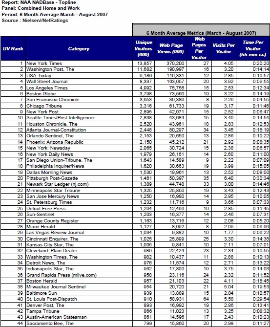
An early assignment I give my postgraduate students is to ask them to tell me what stands out or is unusual or remarkable in the above table of data. The table contains data from the Nielsen usage measurement about visitor traffic at the websites of major U.S. newspaper websites during six months in 2007, the year in which I started teaching this subject at Syracuse.
Nielsen compiled this data from March through August, dividing the aggregate totals by six to adjust for monthly or seasonal variations or news happenstance. The resulting data show the average monthly traffic during that six-month period. The table ranks newspaper websites according to the total average numbers of their unique visitors per month. It also shows how many total webpages were shown to all the site’s visitors in the average month; the number of times that the site’s average visitor visited the site in the average month; how many web pages that average user was exposed to at that site in the average month; and how much total time that average user spent using the site during that average month. Although this data is from 2007, the cogent data in this table haven’t fundamentally changed since then and, indeed, were basically the same in 2000, too.
[Because some newspapers claim that Nielsen undercounts usage, some newspapers have switched to using similar data from its competitor ComScore. Some analysts counterclaim that ComScore’s data tends to overstate usage and that this is the real reason many newspaper have switch to company. The cogent difference between Nielsen’s and ComScore’s data is the methodology each of those companies use to attempt eliminating data points generated by search engine robots and other non-human usage of the newspapers’ websites. I’ve continued to use Nielsen’s data for consistency purposes, simply because I began using it in 2007. Also, some laymen tend to confuse these companies’ aggregate data about all newspaper websites with specific data about individual websites, an important difference. For instance, ComScore reports that during November 2012 nearly 114 million people made slightly more than 1 billion visits to U.S. newspapers’ websites, meaning the average visitor visited 8.9 times per month. Those data calculations are correct, but those approximately 9 visits per month might not have been all to the same newspaper. For example, if one individual in Colorado visited The New York Times’ website four times and visited the Denver Post five times during that month, he would have made 9 visits to newspapers overall, but each of those newspapers would have recorded fewer visits in their own data.]
So, what is unusual or remarkable in this Nielsen usage data table? Most of the Mass Media executives or academicians who see the table tend to think that the sheer numbers of online users and webpage-views that these top U.S. newspaper websites have indicates the successes of that industry’s ‘analog-to-digital’ strategy (i.e., simply offering the printed editions’ contents via online). These executives and academics had been trained in the Mass Media doctrine that successful media are those that have the largest numbers of either users or advertisements. Yet it is Mass Media training that obscures their perspective of how the media environment is changing; I’ve never had a Mass Media executive or academician who’s seen the table tell me the correct answer. Moreover, most of my graduate students answer the problem incorrectly, too. Although they don’t focus on the largest numbers, most of the students attempt to discern and analyze any noticeable variation in data between various newspaper sites (such as, for example, why the St. Louis Post-Dispatch had noticeably higher number of ‘web pages per visitor’ monthly than the other newspapers). I think the majority of my graduate students attempt to find convoluted answers because they’ve grown accustomed to other professors presenting them with deceptive or trick questions.
Yet there is no trick or deception in this data. Like the proverbially ‘elephant in the room’, the correct answer is so obvious that most people fail to see it. What obviously stands out and is remarkable in this table of data is the behavior of the average users of these websites and how radically different it is than the behavior of the average user of those newspapers’ printed editions.
Next webpage: The New Gravitation
Index of the Rise of Individuated Media webpages
© 2014